THÉÂTRE DE L’UNION
CLIENT
Le Théâtre de l’Union is a Limoges-based national theatre. In 2015, the theater changed directors and wanted a new, stronger branding.
rebranding
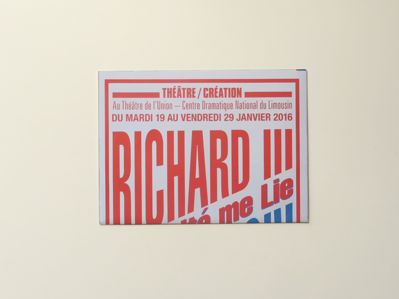
Théâtre de l’Union used to be a cinema over a century ago and had a duotone, type-based branding. We reincorporated its history in its new identity, while taking it a few notches further. The new logo was made in collaboration with French prolific artist Stéphane Blanquet.
In the 2015-16 season program, the titles are typographic plays, reinforced with graphical elements and bold edges… Each play in the program is detachable and printed in two bright Pantone© colors. The posters adibed by the same charter, before integrating photos into the visual identity.
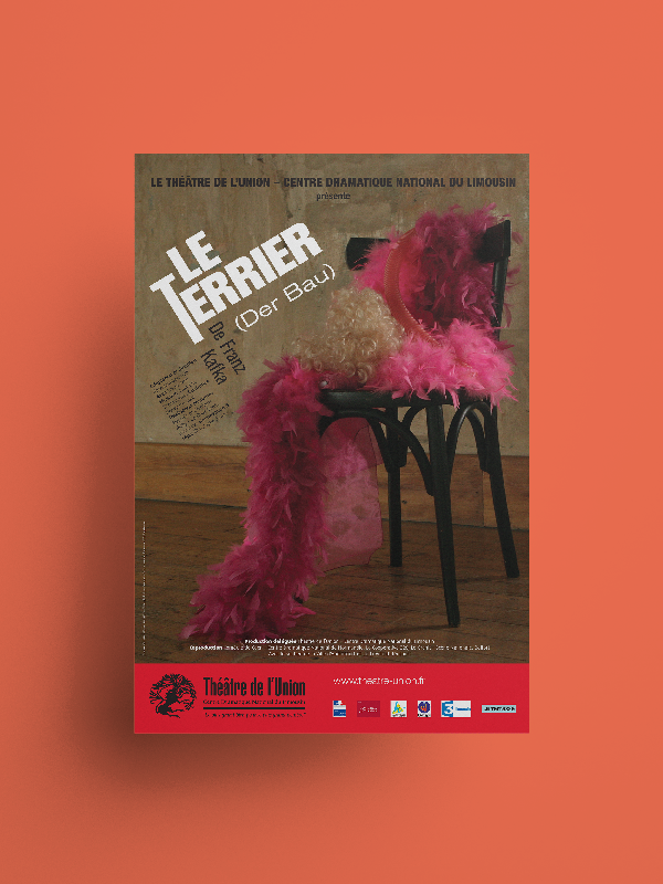
The initial “type-only” charter reached its limit and the theater insisted on adding stage photography to its communication.
The following programs kept the bold element of typography and striking ligns.


